How to address UI issues and field selection in the new SFDMU GUI?
Question:
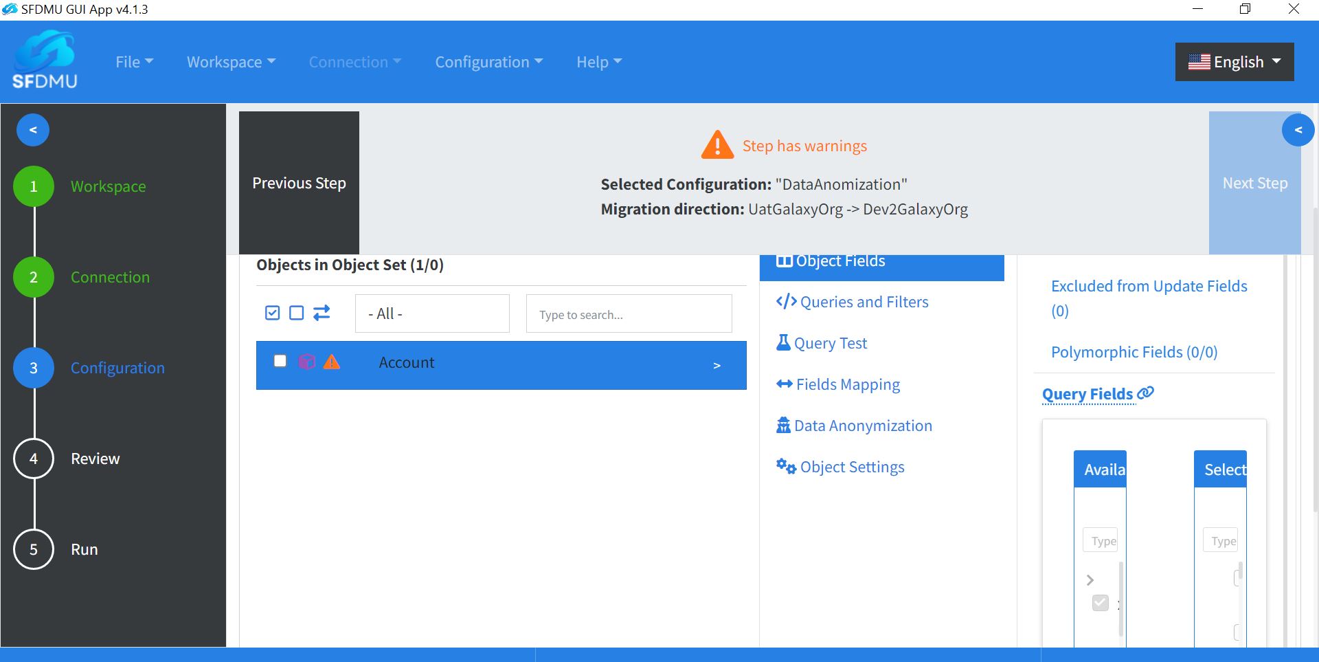
I have switched to the new version of the SFDMU GUI, but I am unable to select object fields, the field selector is too narrow.
How can I fix this field selector view, or how can I roll back to the previous UI version that displayed the field selector better?
Answer:
The current version of the SFDMU GUI, while different from its predecessors, is designed to incorporate the latest SFDMU Plugin features along with other enhanced functionalities. It also supports the latest SF CLI, configurable via the export.json file, unlike the older version that only supports the outdated SFDX CLI.
To address issues with field selection and visibility in the new GUI:
Rectify Errors: Ensure that all field errors are resolved. Hover over warning indicators near each field to review the exact message and fix those issues first.
Adjust UI Layout: Use the blue arrow to collapse the left pane (steps wizard). This expands the main pane and gives you more space to review and select fields.
Monitor Resolution: A Full HD (FHD) monitor resolution usually improves field selector usability in the current layout.
Currently, there are no plans to reintroduce the old GUI layout. If you still prefer the old UI, you can install one of the previous releases from the GitHub Releases page. Keep in mind that older GUI versions may not support the latest SFDMU features and recent platform updates.
